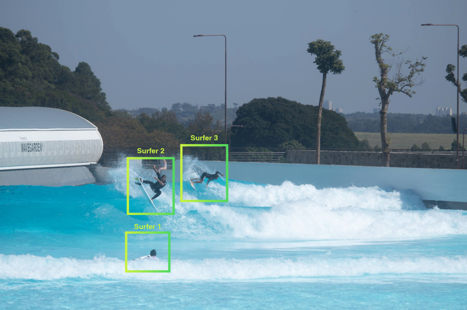
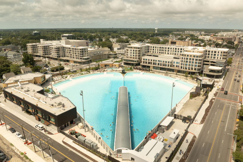
Focused on SUPPORTING THE GROWTH & ADVANCEMENT of SURF ANCHORED REAL ESTATE
Network with INDUSTRY LEADERS, JOIN COMMITTEES SHAPING SURF PARK STANDARDS
The latest RESEARCH, REPORTS, INSIGHTS and NEWS
Surf Park Central is the global trade association for surf-anchored real estate industry. We connect real estate developers, investors, operators, and industry professionals to design, finance, build, operate, and maintain the leading surf-anchored real estate destinations around the world.
As the global surf park trade association we host industry leading events, provide unique data and insights, and connect surf anchored real-estate professionals.
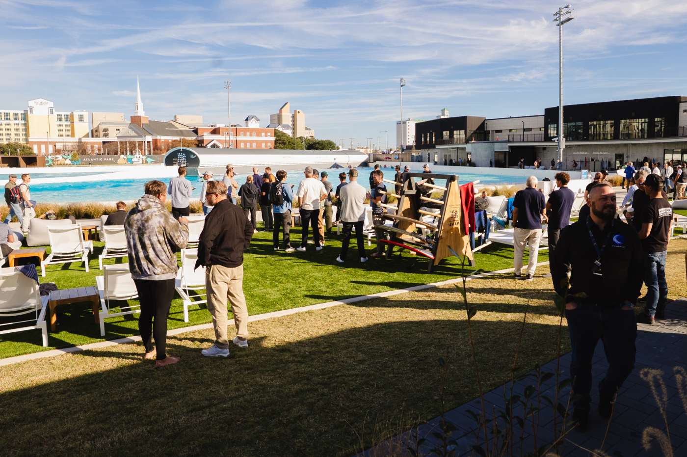
Conferences and events
Our regional events, developer tours, surf park pitch competition, industry awards and Surf Park Summit connect our industry.
Members Only community
Members receive event discounts, access to data and reports, drive industry committees, and engage with the member community.
Premium Reports
We provide original research, data, and insights vital to the success of surf anchored real estate developers, operators, investors, and suppliers.
GROWING THE SURF PARK COMMUNITY
Get the information and connections you need to foster your business’s growth within the surf park industry.
Our events and members-only community gather the brightest minds and most experienced decision-makers from all parts of the industry to work through the opportunities and challenges involved in planning, developing, financing and operating surf destinations.
MEMBER BENEFITS
Being part of our community means staying up-to-date on new developments and opportunities, making valuable connections with key decision-makers and staying ahead of the curve on business opportunities.
FEATURED NEWS
We bring you the latest news and updates from around the world.

